Website Design Rules: 12 Principles We Follow (and How We Maintain Them)
Twelve website design rules we follow on every page, from the five-second first screen and mobile-first layout to contrast, spacing and real proof, plus how we keep a design system consistent.
Good design is not decoration. On a business website it has one job: help the right visitor understand what you do, trust you and contact you, as quickly as possible. These are the design rules we follow on every page we touch, and why each one brings more enquiries.
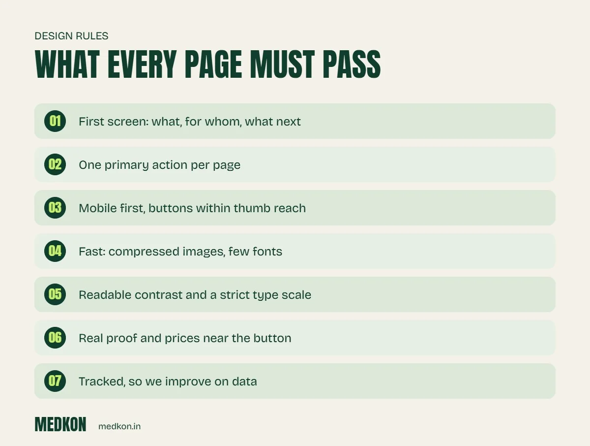
12 website design rules we follow
1. The first screen answers three questions
What do you do, for whom, and what should I do next? If a visitor cannot answer these in five seconds, nothing else on the page matters.
2. One primary action per page
Every page has one main button, such as "Get a free quote" or "Chat on WhatsApp". Secondary links are allowed, but they look secondary.
3. Mobile first, thumb first
Most Indian visitors arrive on a phone. We design the mobile layout first, keep buttons large enough to tap and put WhatsApp and call within thumb reach.
4. Fast is a design decision
Compressed images, modern formats like WebP, few fonts and no heavy sliders. We check Core Web Vitals in Google Search Console and fix pages that fail.
5. A strict type scale
Two font families at most, a clear size hierarchy and line lengths that are comfortable to read. Body text is never smaller than 16px.
6. Contrast you can read in sunlight
Text and buttons meet WCAG contrast guidelines, so they are readable on a phone outdoors and for people with weaker eyesight.
7. Consistent spacing
We use a spacing scale (for example 8, 16, 24, 32, 48, 64px) and never improvise. Consistent space is what makes a site feel calm and expensive.
8. Real proof, near the decision
Client names, case studies, real photos of the team and office, and testimonials are placed next to the buttons, not hidden on another page. Stock photos of smiling strangers reduce trust.
9. Show prices or starting prices
Visitors who cannot find any price often leave to find a competitor who shows one. A starting price filters out bad-fit leads and reassures good ones.
10. Write like a person
Short sentences, plain words and specific claims. No buzzwords and no generic AI-written paragraphs; visitors can tell, and so can search engines.
11. Accessible by default
Alt text on images, labels on form fields, keyboard navigation and visible focus states. Accessibility helps every visitor and helps SEO.
12. Built to be measured
Every button and form is tracked, so we can see what works and improve it, instead of redesigning on opinion.
How we keep a design system consistent
- Design tokens: colours, font sizes and spacing are defined once and reused everywhere.
- A component library: buttons, cards, FAQs and forms are built once and reused, so new pages match old ones.
- A checklist before launch: mobile check, speed check, contrast check, broken-link check and tracking check.
- Monthly review: we look at analytics and fix the pages where people drop off.
Design mistakes that cost leads
- Auto-playing sliders that hide the main message.
- Pop-ups that appear before the visitor has read anything.
- Forms with ten fields when three would do.
- Contact details only in the footer.
- Beautiful pages that take eight seconds to load on mobile data.
Design rules matter most when they connect to what happens after the click. That is why we pair every site with lead capture and follow-up automation. See our business automation service or pricing.
Frequently asked questions
What are the basic rules of website design?
Make the first screen answer what you do, for whom and what to do next, use one main action per page, design for mobile first, keep pages fast and readable, and show real proof.
How many fonts should a website use?
Usually two at most: one for headings and one for body text. More fonts slow the site and make it look inconsistent.
Should I show prices on my website?
Showing at least a starting price usually helps. It filters out bad-fit enquiries and reassures serious buyers.
What is a design system?
A set of reusable colours, font sizes, spacing values and components, so every new page looks consistent and is faster to build.